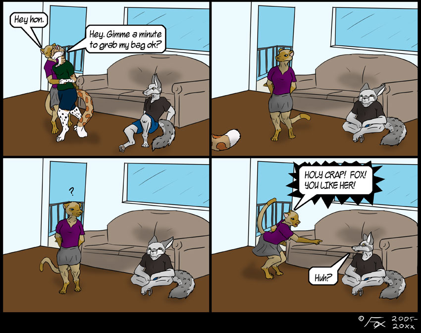
REVELATIONS!
I keep going back and forth about continuing gags, story kind of stuff. I generally try to stay away from it, but habit keeps pulling me back… Anyway, last weeks lead’s to this weeks leads to next weeks. Continuity!
Speaking to the comic itself, I really like how Mei and Mykie look in the first panel, but maybe that’s just because I’m really bad at figures interacting. Yes, I know Fox’s head goes all squishy in panels two and three, but that’s actually intentional. I wanted to really emphasize his droop and expression, but I’m still trying to find that balance of cartoon elasticity and… Well not “realism” but you know what I mean.
Oh… And I’ve come to realize that I suck at drawing skirts. Sorry Mei! ^.^


Actually, the “silhouette” in panel 1 between Mei/Mykie is sort of a hard read for clarity, but I think “squishy fox” and Mei’s “ah HA!!” pose came out really well! Lots of character to the poses! :D The emotions are showing through, and they are very clear as to what’s actually going on and show a nice difference from panel to panel.
I think the pulled back shots to give some differences to the panels instead of just talking heads is a good plan…
Thanks!